Death Cross & Golden Cross: Key Trend Signals
Contents
- Introduction
- What Are the Golden Cross and the Death Cross
- Technical Analysis and the Use of Crosses
- Impact of the Golden Cross on the Market
- Impact of the Death Cross on the Market
- How to Interpret and Use Crosses in Trading
- Practical Application of Crosses in Trading Strategies
- Conclusion
Introduction
There are two well-known signals in financial markets — the Golden Cross and the Death Cross. Their names may sound dramatic, but in practice, they mark key moments when a new trend might be starting. These signals help traders make informed decisions about whether to buy, sell, or wait.
These concepts originate from technical analysis, a method of forecasting price movements by analysing charts and historical market behaviour. One of the tools used is moving averages. When the lines on the chart cross in a specific way, a signal appears. That signal may indicate a shift in trend, and this is where the Golden Cross and the Death Cross come in.
What Are the Golden Cross and the Death Cross
Definition of the Golden Cross
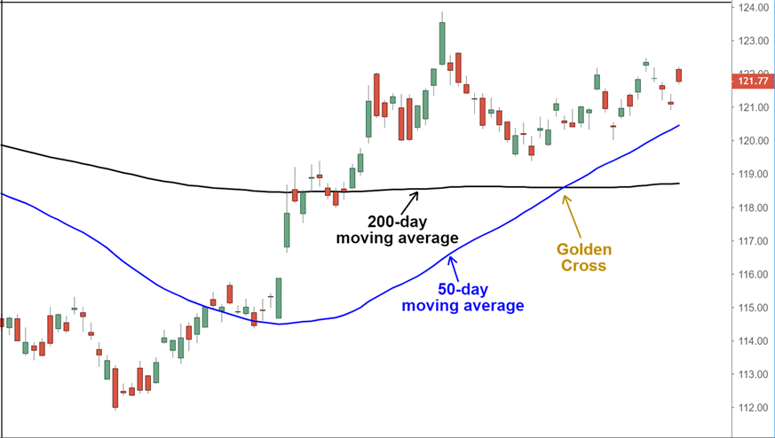
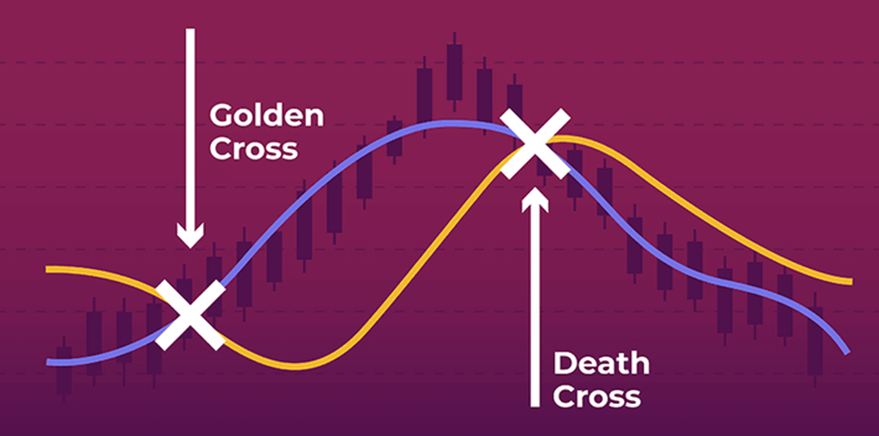
The Golden Cross is often seen as a bullish signal. It appears when a short-term moving average (like the 50-day MA) rises above a long-term moving average (like the 200-day MA). On the chart, you can see the shorter line “breaking through” the longer one from below.
How It Forms
Moving averages smooth out price fluctuations and reflect the overall trend of the market. If the price has been rising steadily, the short-term average starts to move upward. When it crosses the long-term average, it suggests that short-term momentum is stronger than the long-term trend. Traders view this as a potential sign of sustained growth.
What It Signals for Traders
For many traders, the Golden Cross signals the start of an uptrend. At this point, they may begin buying assets in anticipation of continued price increases. This kind of signal can attract investor attention and lead to increased market interest. Often, a Golden Cross is followed by a longer bullish phase.
Definition of the Death Cross
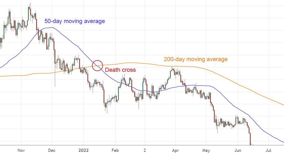
The Death Cross is the opposite scenario. It occurs when the short-term moving average crosses below the long-term one, indicating that the average price over a shorter period has fallen below the longer-term average. On the chart, the shorter line “dives” under the longer line.
How It Forms
The Death Cross forms when the market starts to decline. Prices fall, and the short-term average reflects this by turning downward. If the decline continues, it eventually crosses below the long-term average. This can be a sign that a downtrend is beginning.
Why It’s Seen as a Negative Signal
Traders treat the Death Cross as a warning. It may indicate market weakness. Many will exit their positions or open short trades to capitalise on the decline. Although a Death Cross doesn’t always lead to a crash, it’s a reason to be cautious, especially when other indicators also point to a downturn.
Technical Analysis and the Use of Crosses
How These Signals Relate to Market Trends
The Golden Cross and Death Cross are known as trend-following signals. That means they suggest the possible start of a sustained market move — either up or down. When a Golden Cross appears, it may signal the beginning of a bullish trend. A Death Cross, on the other hand, can indicate a bearish shift.
Both signals help traders understand the market’s overall direction. They don’t predict exact price levels but offer a visual clue of where the market might be heading. Both beginners and experienced traders use these signals because they are straightforward to interpret.
Advantages and Limitations of Using Crosses in Trading
The main advantage of these crosses is their simplicity. You don’t need to study complex formulas — just watch for the crossover between the short- and long-term moving averages. These signals work across all timeframes, from minute charts to monthly ones.
However, there are also downsides. Crosses take time to form, which means they lag behind real-time price action. Sometimes, the market has already begun to move before the signal appears, potentially causing late entries. Another issue is false signals — when a cross appears but is followed by sideways movement or even a reversal.
That’s why experienced traders don’t rely on crosses alone. They consider the broader market context, use other tools, and stay informed on news events.
Examples of Using Crosses in Different Market Conditions
In a bullish market, a Golden Cross can be a valid entry point. For example, if an asset has been trading sideways and then breaks upward with a Golden Cross, this could signal the beginning of an uptrend.
In a bearish market, the Death Cross can help avoid losses. When the market weakens and a Death Cross forms, it might be time to exit a position or even open a short trade.
In a sideways or range-bound market, crosses tend to be less reliable. They can form and reverse quickly, causing confusion and disorientation. That’s why it’s essential to consider the broader market environment before making a decision based on these signals.
Impact of the Golden Cross on the Market
How investors respond to the golden cross signal
Many investors view the golden cross as a sign of market strength. When such a signal appears, it can boost confidence. Some begin buying even if they were previously hesitant. This renewed interest may push prices even higher, especially if the market was already showing signs of recovery.
Sometimes, the reaction is intense, especially when a golden cross forms after a long decline. Some traders who use technical analysis in their trading perceive it as the beginning of a new phase. However, reactions can vary depending on the broader context, such as news, economic conditions, and other influencing factors.
Which markets are most sensitive to the golden cross
The golden cross signal is especially effective in the stock market. Many large investors, including funds and banks, closely monitor this signal. As a result, it can influence institutional behaviour and impact the entire market.
Cryptocurrencies also tend to react. Due to their high volatility and popularity among retail traders, a golden cross in crypto can trigger rapid price increases. Many traders wait for such signals to enter a position.
In commodity markets, the reaction is typically weaker. Price movements there are often more influenced by supply, demand, and external events. However, if prices are already rising and a golden cross appears, it may strengthen the momentum.
Historical examples of market growth following golden crosses
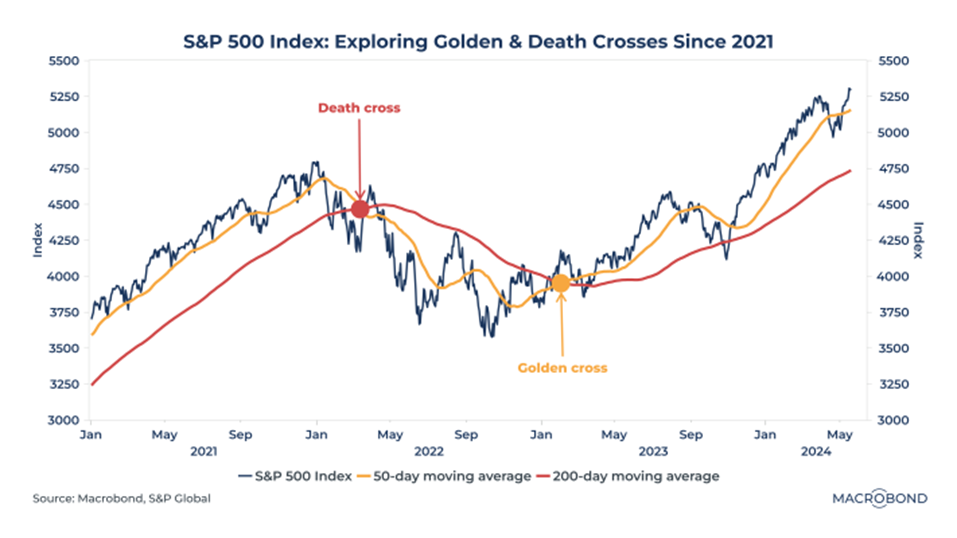
History knows many cases when a golden cross was the beginning of a rise. One example is the US stock market. When a golden cross appeared on the S&P 500 index in early 2023, the market began to rise.
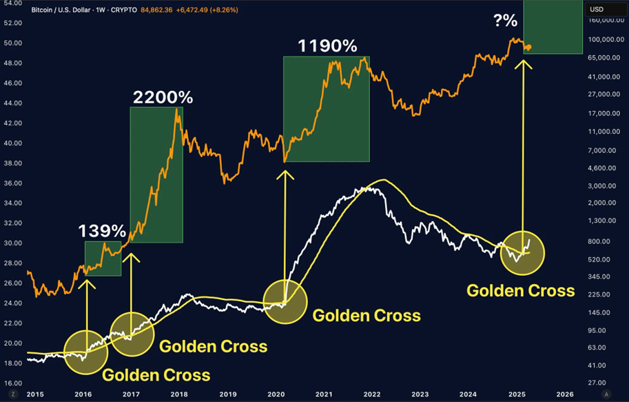
In 2020, following the pandemic crash, many charts again showed golden crosses—signalling the start of a recovery. Bitcoin also displayed golden crosses before significant price surges in 2017 and 2020.
However, every situation is unique. Relying on one signal alone isn’t wise. It’s better to use it as part of a broader strategy.
Impact of the Death Cross on the Market
How the death cross signals potential decline
The death cross occurs when a short-term moving average crosses below a long-term one. This suggests that prices are starting to fall and that sellers are gaining strength. It’s often one of the first signs of a downward trend, indicating market weakness and increasing selling pressure.
On a chart, this moment appears as the crossover of two lines. The short-term average, reflecting recent weeks, turns downward and dips below the slower long-term line, forming a “cross” seen as a warning signal.
Why does this signal often trigger asset sell-offs
Many market participants treat the death cross as a danger sign. Fearing deeper losses, they start selling their assets quickly. When enough traders engage in this behaviour simultaneously, prices can fall sharply.
Some traders open short positions to profit from the decline, adding even more pressure. The result can be a chain reaction: some sell out of fear, while others do so because they see the trend weakening. In extreme cases, this can lead to panic and substantial losses.
Historical examples of downturns after the death cross
While not every death cross leads to a drop, there have been several notable instances where it has resulted in a decline. For example, just before the 2008 global financial crisis, death crosses appeared on major charts, preceding a steep decline in the S&P 500.
In 2020, at the onset of the pandemic, death crosses emerged on many markets, followed by sharp selloffs. The crypto market has also reacted to this signal on multiple occasions. One striking case was Bitcoin’s drop in 2021, when prices fell by tens of percent shortly after a death cross formed.
Still, false alarms happen. Sometimes the market reverses shortly after the signal. This is why traders shouldn’t react emotionally or rely solely on the signal.
How to Interpret and Use Crosses in Trading
The risk of false signals: How to avoid mistakes
Sometimes a golden or death cross appears, but the market barely moves. These are false signals and can mislead traders. Relying on a single indicator may result in losses.
To avoid this, it’s essential to assess market conditions. If the price is moving sideways rather than trending, cross signals tend to fail. Watch trading volume, market news, and other signs of activity.
The importance of using additional indicators
Crosses are more effective when used in conjunction with other tools. For example, you can use trend strength indicators, support and resistance levels, or volume indicators. This helps assess the reliability of the signal.
If the cross aligns with other signs, such as rising volume, a breakout, or positive news, it can be considered more trustworthy. If the cross appears in isolation, it’s better to wait before acting.
The role of timeframes and other factors in decision-making
Signals can look different across timeframes. A daily chart may show a golden cross, while the hourly chart shows a death cross. Choosing the right timeframe is key.
Long-term investors usually focus on daily or weekly charts where signals are more stable. Short-term traders may use smaller intervals, but they face more noise and false signals.
It’s also important to consider the broader market environment. A signal may behave differently during calm versus volatile periods. Experienced traders don’t conclude a single line—they analyze the full context before making a move.
Practical Application of Crosses in Trading Strategies
Example of a trading strategy using golden and death crosses
Crosses can serve as entry or exit points. A simple golden cross strategy might go like this: when the short-term moving average crosses above the long-term one, the trader opens an extended position. They hold it until a death cross appears, signalling an exit or even a short position.
This strategy is most effective during strong trends. When the market moves steadily in one direction, crosses often provide timely signals. In uncertain or choppy conditions, though, signals may be late or misleading.
Combining crosses with other technical indicators
To increase accuracy, traders often combine crosses with other tools. One standard indicator is the RSI (Relative Strength Index), which indicates whether an asset is overbought or oversold.
If a golden cross appears and the RSI indicates the asset is not yet overbought, it may present a good buying opportunity. If a death cross appears but the RSI indicates oversold conditions, the market may soon rebound, making selling premature.
Support and resistance levels also help. A golden cross near support can strengthen the signal, while a death cross near resistance may confirm a downtrend.
Volume indicators are also helpful. Rising volume during a crossover adds confidence. A falling volume may signal a weaker trend, suggesting caution.
Tips for Beginner Traders

-
Don’t rely on crosses alone. One signal won’t tell the whole story. Use them as part of a broader strategy.
-
Consider the overall trend. Crosses work better when the market already shows a clear direction. In sideways markets, they often fail.
-
Pay attention to the timeframe. Daily signals are usually more reliable than those on hourly or minute charts.
-
Backtest the signal. Before using it in real trading, check how it performed on that asset in the past.
-
Use stop-losses. Even the strongest signal can fail. A stop-loss limits losses if the market turns against you.
Conclusion
Golden crosses and death crosses are simple yet powerful tools in technical analysis. They help identify potential trend reversals or continuations. While they don’t offer exact predictions, they can be valuable when used with other indicators and a thoughtful approach.
For beginners, it’s best to take the time to study signals in practice and use demo accounts before risking real money. With experience, you’ll learn to distinguish strong signals from false ones. The key is not to rely on a single tool, but to view the market as a whole.