Marketplace Dashboard Improvements
Hello! We are excited to introduce the updated dashboard on the marketplace. It now includes new metrics, indicators, and charts. In this article, we’ll walk you through the key changes and explain how they will help you more effectively track the returns on your investments.
First, let’s take a look at how the dashboard used to be:
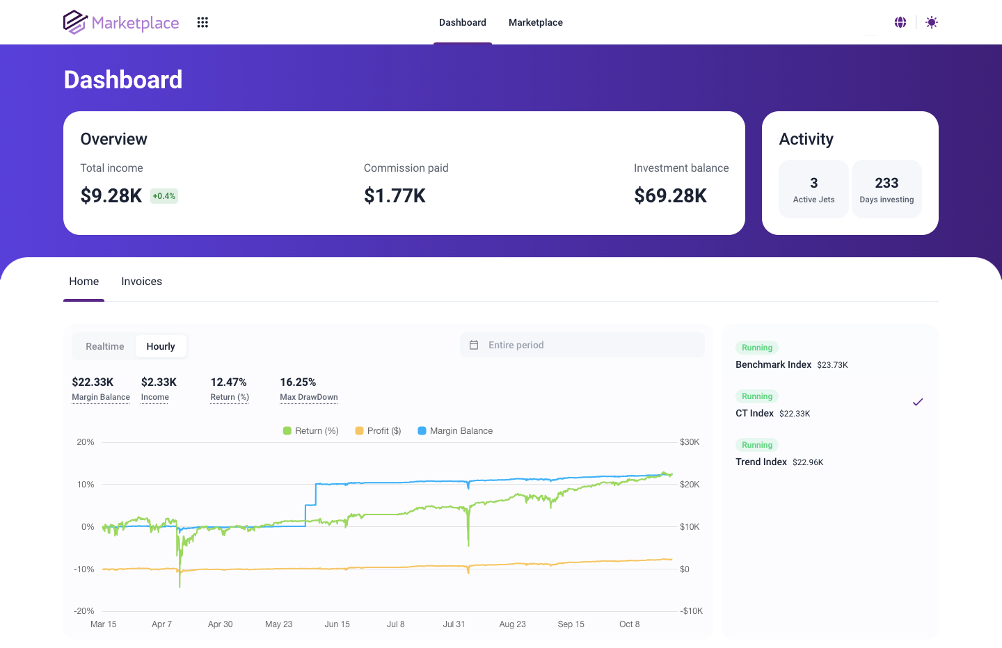
It was informative, but something needed to be added. We identified the additional metrics and improvements necessary for a clearer understanding of investment profitability and implemented them in the best way possible:
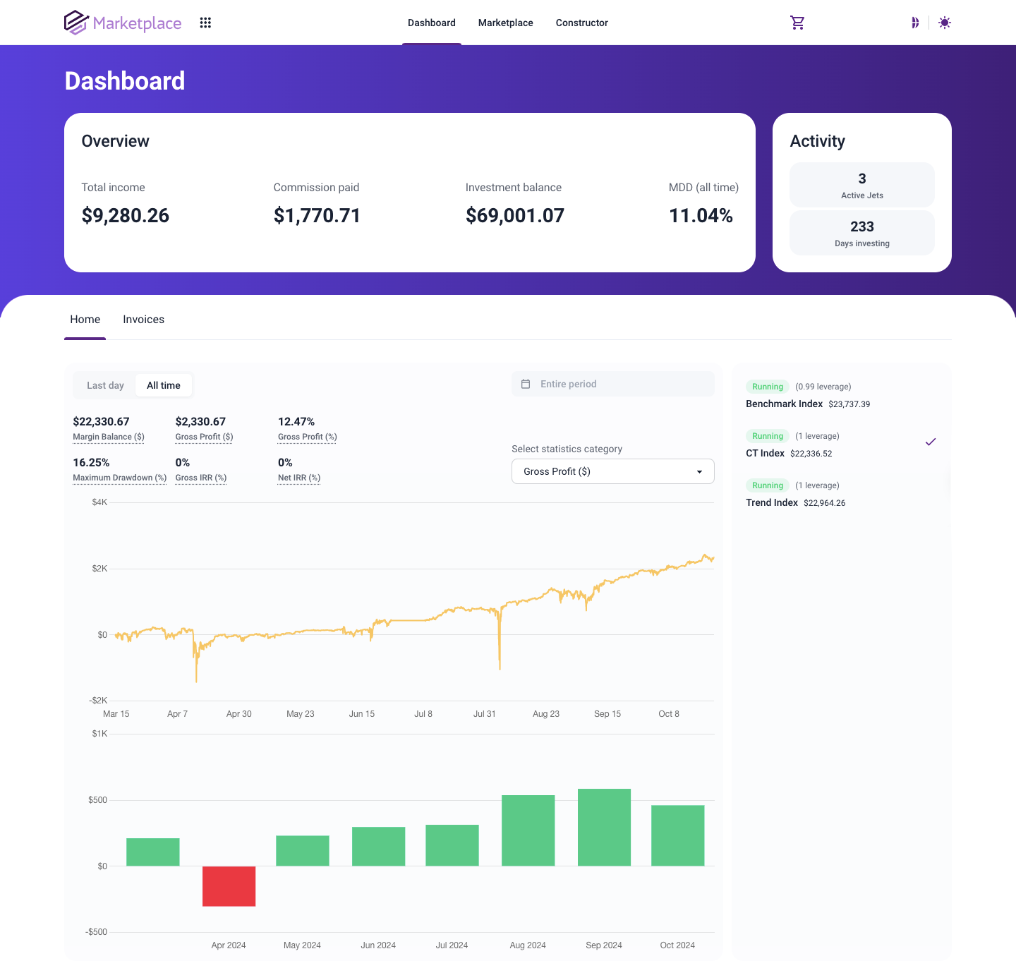
As you may have already noticed, the new dashboard provides a more visual representation of portfolio metrics, such as the statistics of launched JETs and the investment return history. Let’s go over everything in detail:
Contents
- MDD for the entire account
- Gross IRR and Net IRR Indicators
- Category selection for displayed statistics
- Histogram for displaying statistics
- Other improvements
MDD for the entire account
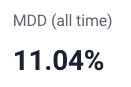
We’ll start reviewing the updates from top to bottom. The overview now includes a new metric – MDD (Maximum Drawdown) for the selected display period (all time by default). It shows the maximum drawdown on the account as a percentage of the highest return. Previously, you could only track the maximum drawdown of copied indices separately on the account, but now this overall figure for the entire account has been added. Let’s move on.
Gross IRR and Net IRR Indicators
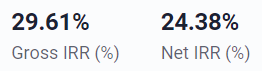
The hourly chart now displays two new indicators: Gross IRR shows the annual percentage return of your investment portfolio before deducting TradeLink commissions, while Net IRR shows the annual percentage return of your investment portfolio after deducting all commissions. These two important metrics help analyze the effectiveness of investments.
Category selection for displayed statistics
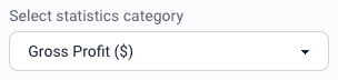
With the addition of new metrics, you can choose which ones you would like to view in more detail, whether it’s the margin balance, maximum drawdown, gross profit in percentage and dollars, or other key indicators. Each can be displayed on the hourly chart, both for the entire period or for a selected timeframe. All statistics are right at your fingertips.
Histogram for displaying statistics
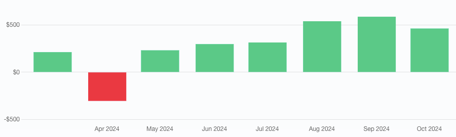
Now, most indicators on the marketplace dashboard are duplicated in the form of a histogram of monthly values, allowing you to have a more global view of your investment statistics. We hope the columns of your histogram will always be green.
Other improvements
Small changes play a big role in the overall picture. Therefore, we cannot overlook them.
The hourly chart is now called the “all-time chart,” and the “real-time chart” has been renamed to the “last day chart.” These renamings were made to avoid confusion. Now it’s clearer.

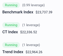
We’ve also highlighted the leverage sizes of copied indices. Leverage in the marketplace refers to the multiplier of the position volume relative to copying the index from the basic strategies. It’s an important parameter that more clearly displays the risks of a particular investment.
There are so many improvements that we encourage you to explore them directly in the dashboard while also checking the success of your portfolio. We believe that the indices you’ve selected are showing impressive performance.
Thank you for your interest in our platform. We will continue working hard to provide you with the best service.
Best Regards,
The TradeLink Team